Foundey · Senior Product Designer · September 2026
Fifty minutes to answer it.One night to build it.
Foundey asked for a low-fidelity redesign of a warehouse operations dashboard, in under an hour. What follows is the argument I wrote and the product AI agents built from it overnight, against eleven gates that grade themselves. My own hands on it came to a handful of prompts and a few minutes of reading. Nothing here was drawn in Figma.
50 min
First commit to a live URL
12:05 → 12:55, day one
12
Commits with nobody awake
22:20 Mon → 13:07 Tue
641
Automated checks
285 unit · 308 end-to-end · 48 pixel
11
Quality gates
Nine of them a single command
0
Screens drawn by hand
The Figma files are generated
The ask
Two sentences, from two people who cannot see each other.
The brief gave a fulfillment centre, a dashboard nobody trusts, and two complaints. Everything below is an answer to one of them.
“I never know what needs my attention first.”
“I cannot see what each worker is doing.”
- Under 1 hour
- Low fidelity or wireframes
- Graded on product thinking
The diagnosis
The old screen already ranked. Ranking was never what was missing.
Its queue was titled “Needs Your Attention, ranked by urgency”, and people still said they did not know what to do first. So the order was not the problem. Four other things were.
01 · Ranked by urgency
It ranked, but never said why.
A number nobody can see is a number nobody trusts. The score was real and invisible, so the order read as arbitrary.
02 · ORDER · NOTIFICATION · COMMS
It labelled by where a task came from.
Three chips, and not one of them is a reason to act. Which inbox something arrived through says nothing about what happens if it waits.
03 · Review · Review · Open · Review
Nothing on it was the first thing.
Four rows, a button on each, and the top two share the heaviest button on the screen. A ranked list whose first and second place look identical has not finished ranking.
04 · View all 6 items needing action
There was no way to be done.
A queue that never empties gives a shift no shape. Nobody can pace work they cannot see the end of.
The answer
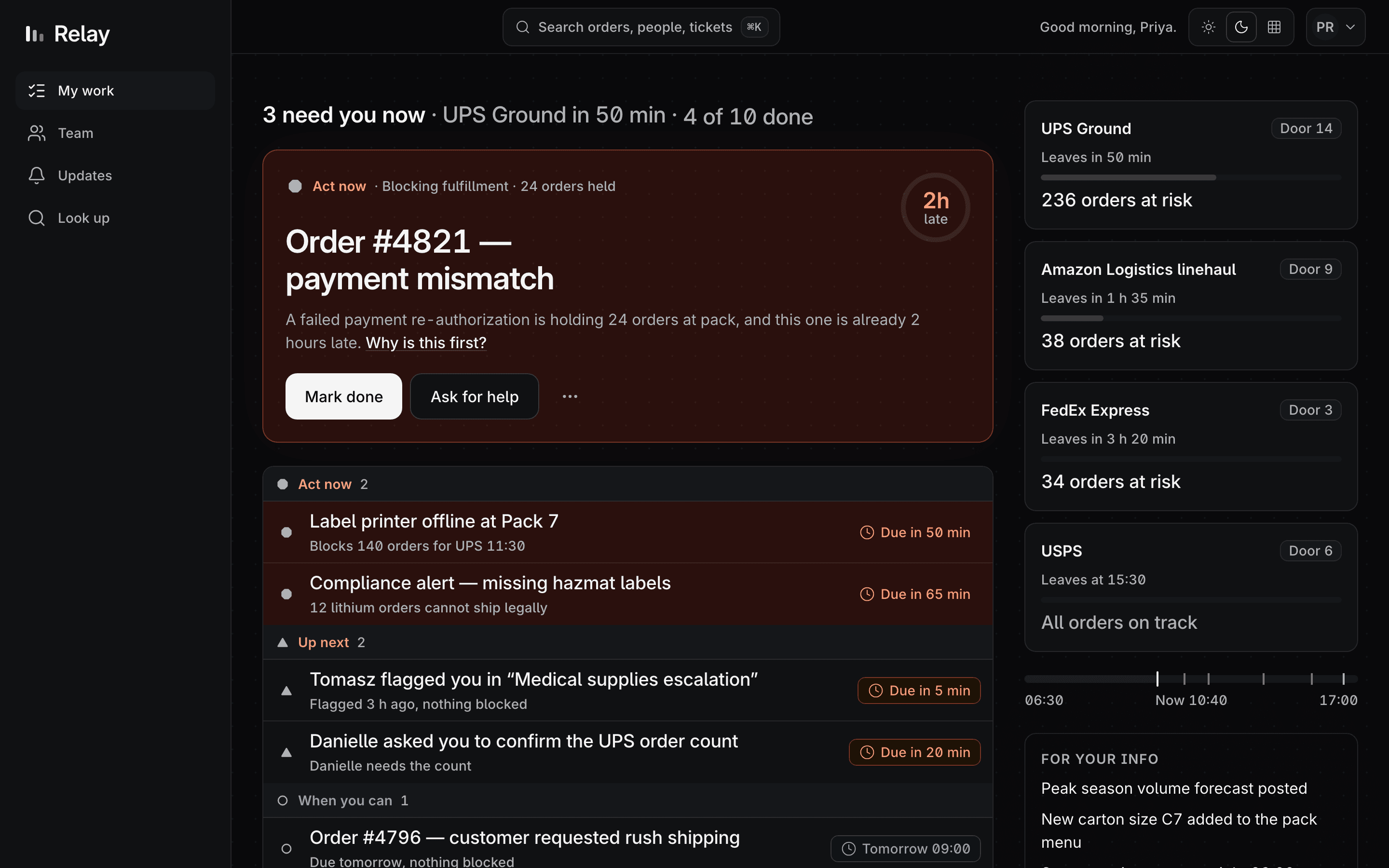
One thing at the top, and the reason written underneath it.
Not a better sort. A screen that commits to a single next action, says out loud why that one, and can be finished.
The score, in plain words
“Why is this first?” opens the actual arithmetic. Not a confidence bar, not a coloured dot — the three numbers that produced the rank and the threshold they crossed.
Four tiers, instead of a feed
Grouped by what happens next, never by where the task came from. The tier name is the instruction.
- Act nowScore 60+, or anything about safety. Someone is blocked, or a truck is.
- Up nextScore 30–59. It becomes Act now if it waits.
- When you canUnder 30. Real work, no clock on it.
- For your infoNot scored at all. Read it, do nothing.
And a way to be done
Finish the last one and the queue does not refill itself. It says the shift is clear and shows what was finished. A queue with no end has no pace.
The proof
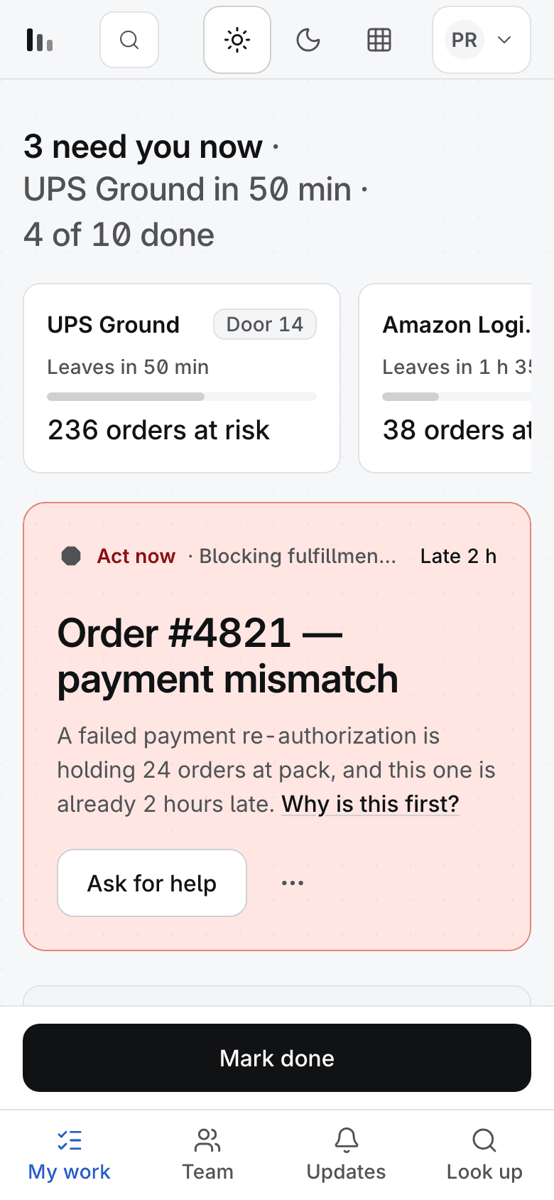
If the ranking only works in colour, it does not work.
Wire is a real mode with its own token values — every chroma channel multiplied by zero, lightness untouched. It is not a grayscale filter, and a lint rule keeps it that way. Switch it and check that you can still tell what to do first.
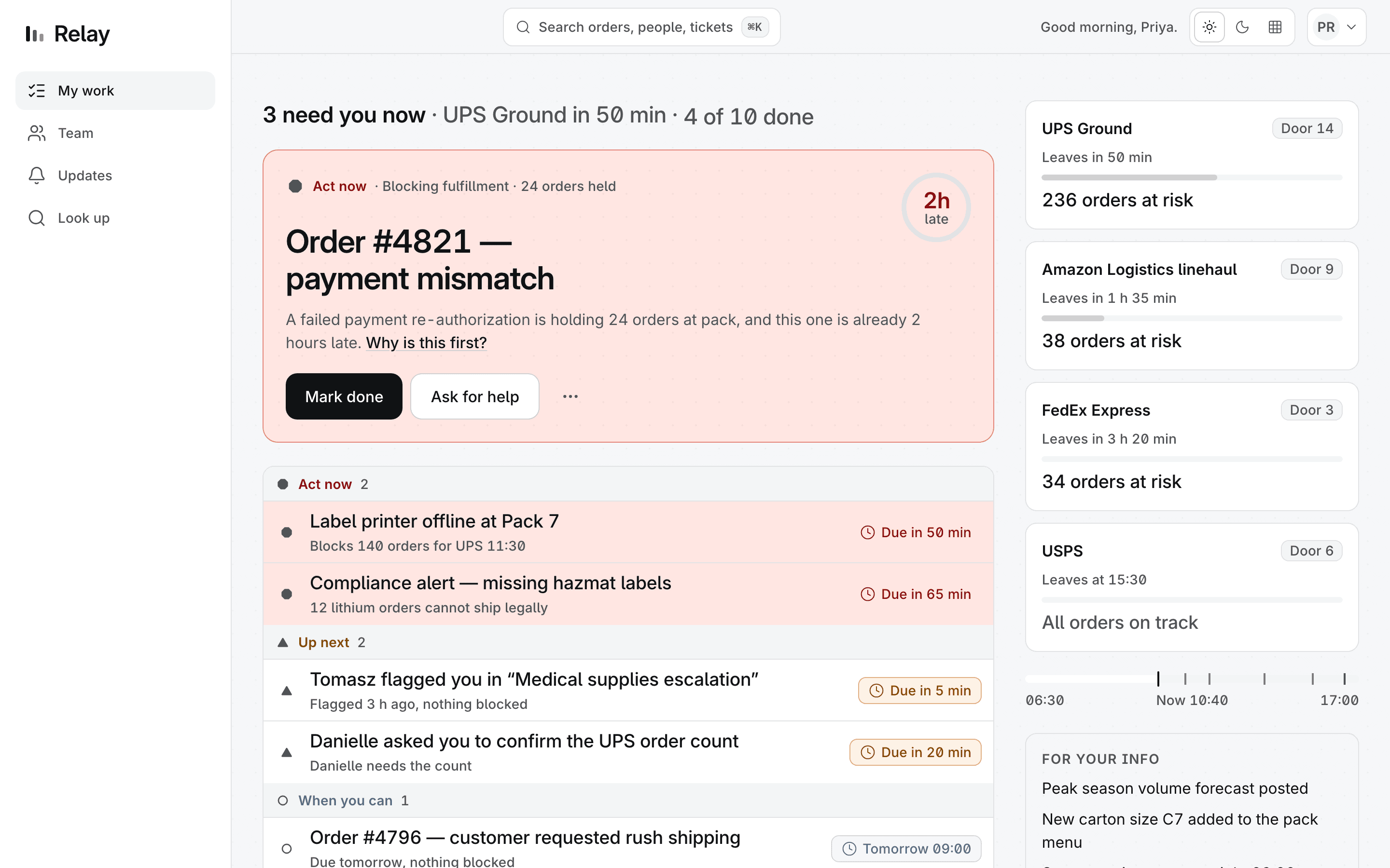
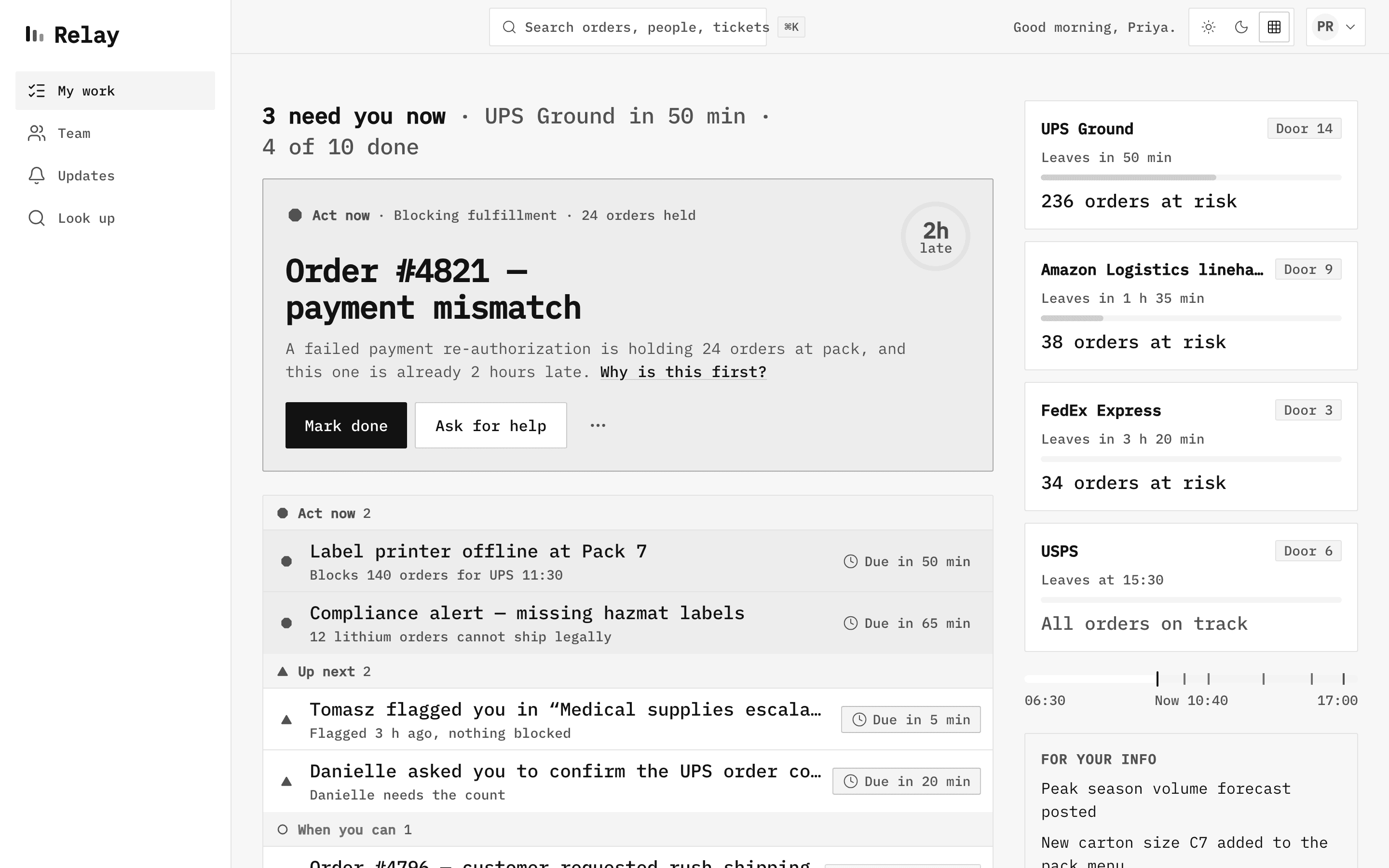
Hi-fi. Tier tint, tier hue, tier weight.
This is also the brief’s low-fidelity answer, kept live instead of screenshotted: the same shipped screens, with every colour channel switched off. Rank survives in shape, label, position and weight.
The process
I wrote the prompts. The agents wrote the code.
Read out of git log, in the machine's own time zone. Twelve commits landed between the last thing I typed one night and lunchtime the next day. Six of them arrived between midnight and half past eight, and three beats on this whole timeline are a person.
- Me, deciding something
- An agent, shipping something
12:05
Mon 22
First commit. The clock starts.
One prompt, holding the argument: rank by consequence, say why, make it finishable. Out comes a scaffold, tokens, seed data, and a priority model with its own tests.
12:55
Mon 22
A deployed prototype, 50 minutes in.
Both screens, updates, look up, a ranked queue, a wireframe toggle and a production URL. That is the answer to the brief as written, and it is the last thing anybody asked for that afternoon.
15:19
Mon 22
A second agent reviews the first, and it does not go well.
Measured, not eyeballed: the main column was narrower at 1024 than at 1440, the undo toast never appeared on screen, and wireframe mode hid its own off switch. The one beat here that is a document rather than a commit — which is why it has a file's timestamp.
16:07
Mon 22
My call: throw the execution away and start again.
The product argument survives; the build does not. The prompt that replaces it is a plan with eleven gates, and a rule — nothing advances a phase without a green one.
22:20
Mon 22
Last thing I typed that night.
Make the test loop cheap to run and cheap to read, so a long unattended run does not drown in its own output. Then bed.
23:18
Mon 22
Foundations: type, colour and geometry tokens.unattended
One source of truth for every value the screens are about to be built from.
01:11
Tue 23
The worker screen.unattended
Hero, the reason underneath it, the openable score, four tiers, and a finish line.
02:46
Tue 23
The manager board.unattended
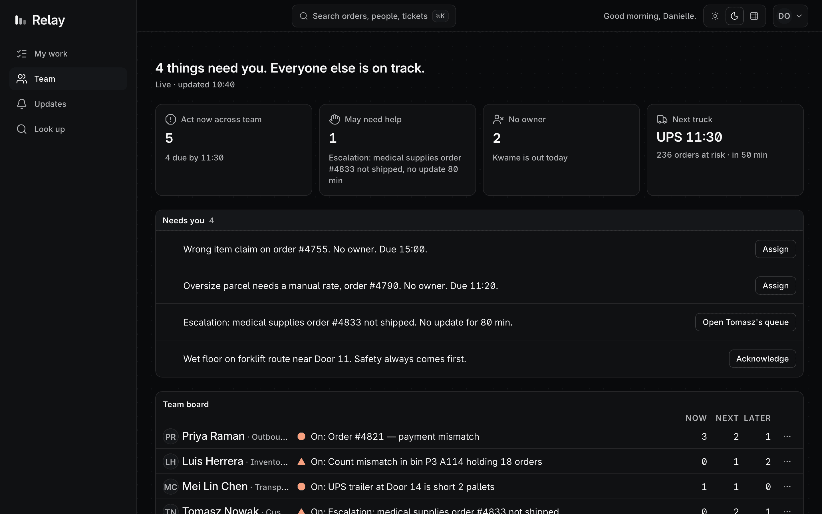
Exceptions first. Four tiles that filter. Never a stopwatch on a person.
05:28
Tue 23
Updates, search, and the ends of the day.unattended
All-clear, end of shift, and the empty states that make a queue finishable.
10:33
Tue 23
Motion: fourteen moments, each with a reduced-motion variant.unattended
The done choreography first, because it is the one people will see a hundred times a shift.
13:07
Tue 23
The deck. Twelve commits since the last instruction.unattended
Part A is the one-hour answer in ten slides. Part B is marked Optional on every slide.
14:11
Wed 24
A third agent reviews the whole thing and finds seven real defects.
One that built none of it drives every route at three widths. It also catches that the first fix for one of those defects was itself wrong, and says so in writing.
17:24
Wed 24
Ship.
Every gate re-run against the deployed URL, not against a local build.
My part is small, and it is meant to be: an argument, a plan, a few hard constraints, and a prompt at the end of the night. Minutes of typing, not hours of drawing. What makes that safe is not trust — it is that every claim an agent makes here is checkable by a command someone else can run, and that the agent which grades the work is never the one that did it.
The constraints
Nothing is graded by looking at the thing it grades.
Eleven gates. Nine are a command, so they cannot be talked out of a red. The last two are judgement, and are done by a session that did not build the thing.
- G1command
Every colour resolves to a token. No literal hex outside one file
- G2command
Controls sharing a row share a height. Every touch target ≥44px
- G3command
Six widths render every surface with no scroll, overlap or clipping
- G4command
Zero axe violations on every route in all three modes. AA on every pair
- G5command
With colour removed, the ranking is still recoverable
- G6command
Every animation has a reduced-motion variant. Nothing loops
- G7command
Clocks and greetings are identical in three time zones
- G8command
Lighthouse ≥95 for performance and accessibility, median of three
- G9command
Verb-first buttons, no orphaned labels, grade ≤8 reading level
- G10judgement
Each Figma file matches what shipped, verified by screenshot
- G11judgement
A session that did not build it drives every route and writes the review
What the gates cost to run
- 283 unit tests
- 0.5s — the priority model, copy, tokens, contrast pairs
- 304 end-to-end tests
- 78s — size contract, six widths, axe, wire, reduced motion
- 48 pixel baselines
- 10s — eight surfaces at six widths, compared not described
The honest part
What I did not do.
A case study that only lists wins is a sales page. These are the choices a reviewer would find anyway by opening the repo, so they are here first.
- 01
I did not draw a single screen in Figma.
The three Figma files exist — 42 frames, 59 components, 81 variables in three modes — and they were built last, generated from the shipped code and its tokens. A design system maintained by hand in two places drifts within days. This one has a direction, and v4 re-ran it: every frame was re-pointed at the brief's own rows by script, not by hand.
- 02
I did not keep my promise that no pixel was nudged by eye.
v3 said not one spacing value was nudged by eye. v4 nudged three: the tier glyphs were redrawn a third lighter, the account control's padding is 5 and 7 rather than 6 and 6, and the ring's late label was sized against a chord I measured. Everything else is still a token with a test behind it — including the icon stroke ladder, which this system had described since v3 and never once applied.
- 03
I did not do user research.
No interviews, no usability sessions, no users at all. The two personas, the site, the carriers and the cutoffs come from the brief and from one frozen Tuesday at 10:40. The desk research that does exist — three reference reports and fourteen Mobbin searches — is in the repo under plan/.
- 04
I did not sit and watch it build.
A handful of prompts, then sleep. The longest stretch of work in this repository ran from 22:20 to 13:07 with nobody at the keyboard, and the reviews that caught its mistakes were run by other agents, not by me reading diffs.
- 05
I did not finish everything, and the repo says so.
The demoted hero does not animate back into its row. Reduced motion collapses globally instead of per moment. /team scrolls sideways below 390, a width the app does not claim. Each one is written down where it happened rather than quietly left out.
Go and look
Everything here is running, not rendered.
Two product screens, the deck, a design system read out of its own stylesheet, and the repository behind all of it.
The product
The worker's screen
One thing at the top, the reason under it, four tiers below. Press E to finish it, ⌘K for anything else. Demo controls are in the top bar.
The product
The manager's screen
Exceptions before roster. Four tiles that filter to what needs a decision, then who is already on what.
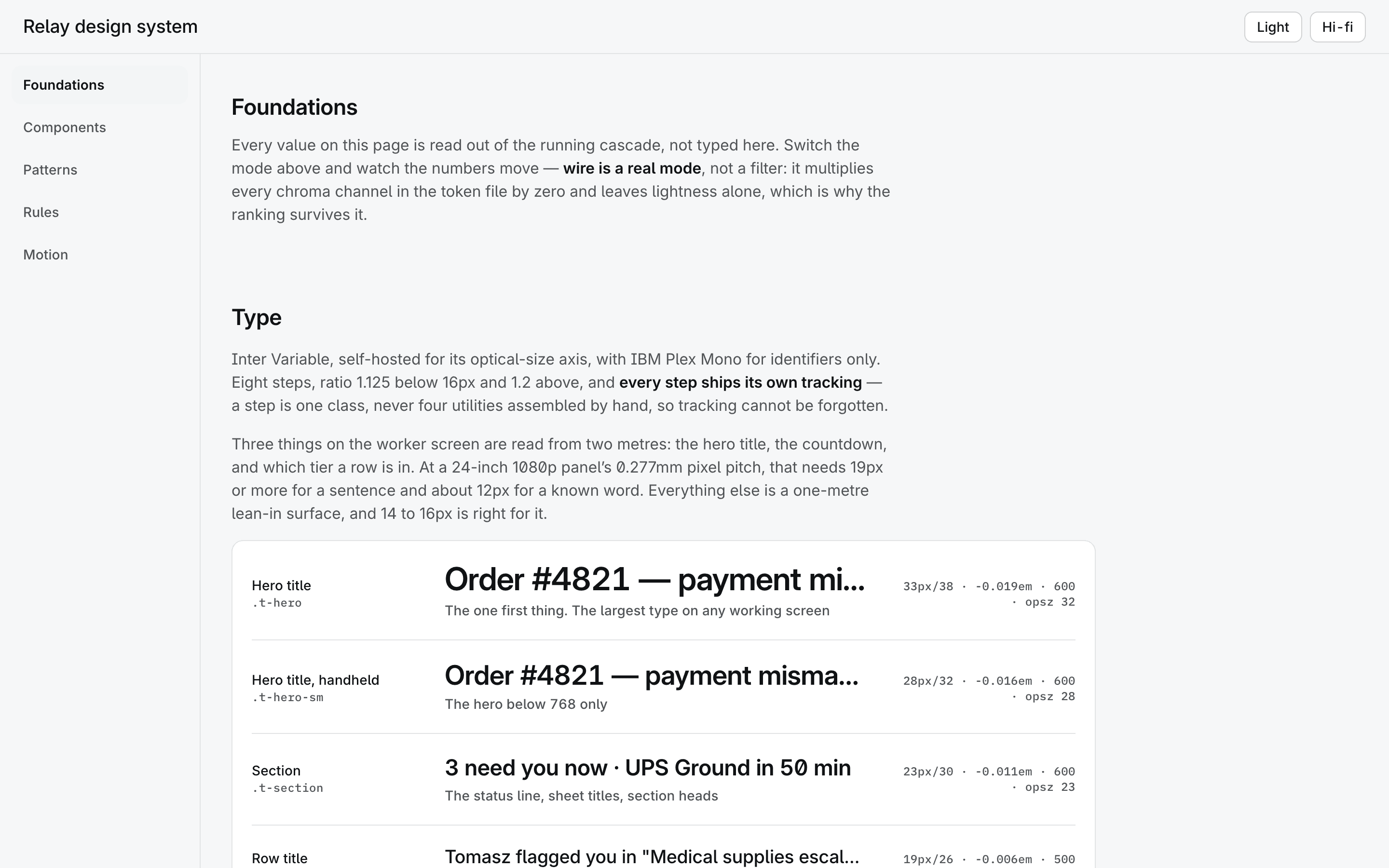
The system
The design system
Foundations, components, patterns, rules and motion — every value read out of the running cascade, not typed by hand into a page about itself.
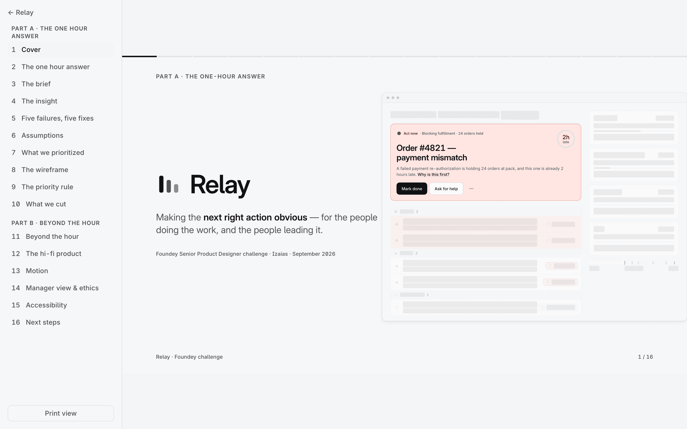
The argument
The deck, in sixteen slides
Part A is the one-hour answer. Part B is everything past it, labelled Optional on every slide. Arrow keys move.
The Figma files
Generated from the shipped screens and their tokens, after the fact — variables in three modes, every component a variant set, and eight flows runnable in presentation mode.
The repository
The plan, the gates, the tests, the pixel baselines, and this page. The commit messages are the log the timeline above was read from.